Visual Storytelling Tips for Designers: Turn Pixels into Powerful Narratives
Chosen theme: Visual Storytelling Tips for Designers. Craft compelling narratives that guide the eye, stir emotion, and spark action. Dive into practical techniques, lived anecdotes, and creative prompts you can apply today. Share your favorite visual storytelling trick in the comments and subscribe for fresh, story-first design insights.
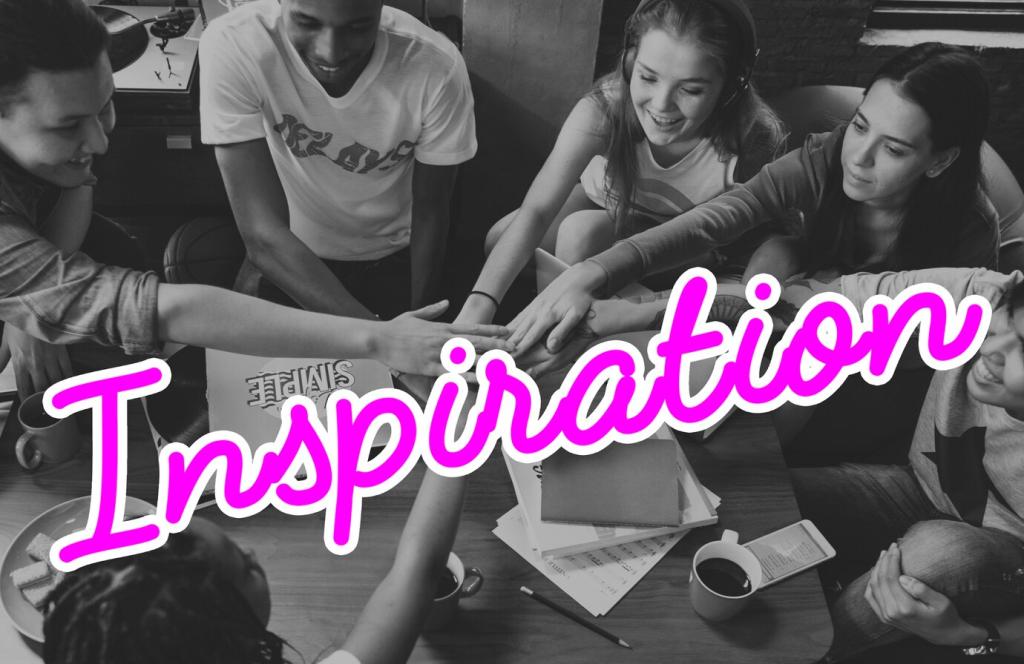
Open with a Magnetic Hook
Lead with a bold focal point, an unexpected contrast, or a provocative question. The hook should promise value immediately, inviting viewers to invest attention from the very first glance and priming them for the journey ahead.
Build Tension Through Contrast and Rhythm
Alternate scale, color, and density to create momentum. Strategic contrast, staggered spacing, and progressive reveals turn static layouts into unfolding narratives that propel users toward the next moment with curiosity and anticipation.
Resolve with Clear, Satisfying Outcomes
Conclude with clarity: a summary insight, a decisive call-to-action, or a visual payoff. When the resolution aligns with the opening promise, viewers feel rewarded and are more likely to engage, share, or take the intended next step.
Design around F- and Z-pattern scanning. Place the narrative hook where eyes naturally land, then cascade supporting details along predictable paths so readers never feel lost or uncertain about what matters most on the page.
Use Scale, Proximity, and Alignment
Enlarge critical moments, cluster related elements, and align edges to create order. These simple, reliable tools create an unmistakable storyline, ensuring attention flows logically from headline to proof to action without friction.
Whitespace as Timing and Breath
Treat whitespace like pauses in conversation. Generous spacing slows the pace for reflection; tighter groupings speed it up. This rhythmic control helps your visuals feel intentional, calm, and narratively confident from start to finish.
Color as Emotion and Plot Device
Set the Mood with Purposeful Palettes
Choose palettes that reinforce the narrative tone—optimistic, urgent, reflective, or playful. Try triads for energy, analogous sets for harmony, and muted bases with a single accent when you want readers to focus with calm intensity.
Create Beats with Contrast
High contrast can mark a turning point or reveal. Reserve it for pivotal beats. By rationing contrast, you protect narrative clarity and make each emphasis feel meaningful rather than noisy or visually exhausting to viewers.
Typography That Speaks in Character
Choose a confident display face for headlines and a humane text face for reading comfort. Aim for complementary contrast—shape, x-height, and texture—so the pairing sounds like a conversation between narrator and supporting cast.
Typography That Speaks in Character
Adjust line length, leading, and paragraph spacing to modulate tempo. Short lines create urgency; generous leading invites reflection. Use pull quotes like dramatic pauses that foreground emotional beats and re-energize reader attention.
Motion and Microinteractions as Story Beats
Use ease-in-out for natural acceleration and deceleration. Physical plausibility builds trust. When motion feels believable, users infer intention effortlessly and follow your visual story without cognitive strain or surprise stumbles.
List emotional beats first, convert them into frames, then prototype the riskiest transitions. This reduces waste and ensures your pixels serve the narrative rather than fighting it with decorative but directionless decisions.
Storyboard the Journey Before You Design
Define reusable elements—characters, symbols, colors—that represent story roles across screens. Shared tokens make complex systems feel coherent, helping teams ship faster without eroding clarity or fragmenting the overall narrative experience.
Accessibility Makes Stories Stronger
Contrast, Size, and Legibility First
Meet or exceed contrast ratios, use adequate type sizes, and avoid text over busy images. Clear legibility lets your narrative shine, ensuring every beat remains understandable under varied lighting, devices, and abilities.
Alt Text as Invisible Narration
Write alt text that conveys intent, not just objects. Describe why the image matters in the story. This invisible narration keeps the plot intact for screen reader users and strengthens your own narrative discipline.
Test with Diverse Users Early
Invite feedback from people with different abilities and contexts. In one project, a simple keyboard-focus fix doubled task completion. Inclusive design doesn’t dilute stories—it sharpens them by removing accidental barriers.